Friday 28 November 2014

Logo Research

I have noticed that RnB artists do not really have proper logos. But what they do have is consistency. Their artist name has always been the same but nowadays more developed but surely still the same. Here are some examples:


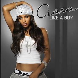
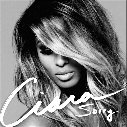
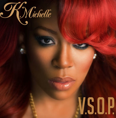
I want my font to be like these artists, the writing looks personalised to their style like i want mine to be. I need to make sure my font is up to date with modern society as the albums on the left are past albums and the ones on the right are recent.

So my font will be my logo.

What i did was, i went on a font website and i found a font called Bizarre which looks like Rihanna's font that she consistently uses. I decided that i could put my artists initials on top of each other to give a logo that is small recognisable and different. I also experimented with my original font Madamoiselle Camille which is a swirly skinny font which looks sophisticatedly soft.


These are my ideas that i have come up with. I may experiment with both fonts and see which one come out better. 

Shooting Schedule


This is my shooting schedule which i will conduct my filming of my music video. I also put in the Digipak shoot that i have to do and possible re-shoots.

The first day of my schedule is when i want to shoot for my Digipack images. I will have my artist present to stake the pictures and i should have images of at least two different outfits.
The next day i will start on the shooting for my music video with two of my actors. I will review the footage and maybe re-shoot again the day after and edit my digipak images.

Clothing Ideas


These are some of my clothing ideas that i believe will work for an RnB artist.
The first one is of a dress which i quite different than a normal RnB artist dress. I decided to make it shorter and cuter than extravagant and boot heels. The second outfit is of a nice skirt with a crop top and low shoes. The third outfit is of a long lace skirt with a crop top to show my artists shape with heels. And lastly, a pink dress with heels.
For the boy in my music video, the first outfit i would like him to wear is basketball wear which consists of a vest top and some shorts. The second outfit will be a shirt with jeans. Then at the end, the outfit will go back to the basketball wear but different. 


For the girl in my music video, the first outfit will be worn at the start when she sees the boy playing basketball. The second outfit will be used as she is talking to the boy on the phone and the third outfit will be near the end when she is with the boy.
I used the website Polyvore to create these outfits which may change because it all depends on what my artist and actors already have which is what i will work with.

Wednesday 26 November 2014

Location Images

These two pictures is the location setting that i would like to base half of my music video on. This place i close to my house and it is a free basketball so i don't need any permissions to film on it.


Friday 21 November 2014

Participant Agreement Contract

I decided to make a participant agreement contract so that i am positive that the actors in my music video will not let me down or pull out at the last minute.


Production Log 1.

Today we started working on our Digipak panels. 

I decided on my first panel i would have my artist sitting on some stairs posing to the camera so we can see her in a chilled environment.

This is the outside of the house that i shot this panel at: 


I decided on my second panel i would have my artist in the comfort of a bed which she would be on and i will get some shots of her looking in the camera and some where she isn't so that i can choose which one i would like on my Digipak.

I decided on my third panel i would have my artist posing on her sofa so it looks really chilled and relaxed.

I decided on my fourth panel which is the front cover, i will get a close up of her face using Alicia Keys album cover as an inspiration as she sings about relationships and most of her album covers have a close up of her face. 

Production Log 2.

Today we started working on our artists mood board. We looked at other students mood boards from the previous years to help us have an idea of what our one would look like. The first thing that i did was think about some of my conventions of my Rnb genre which are: 

  • Jewellery
  • Make up
  • Bodily Tattoos/ Piercings
  • Material Goods 
The next thing i did was think about my colour theme as i said that i would like to incorporate it in somewhere. I looked for purple items like:
  • Roses
  • Lipstick 
  • Nail varnish 
  • Musical instruments
  • Make up 
  • and other images to personalise it even more.


I also thought to include my influences to show who my artist is and what her music preferences are.
I also wanted to show the performance side of my artist by including stages and the band that she sometimes uses in her live performances.

Tuesday 18 November 2014

1st Photoshoot - 2nd Photoshoot - 3rd Photoshoot &Adding the pictures to my Digipak

1st Photoshoot:   
These are some of the type of photos that i took on Monday. These are tester ones on my new artist as i needed to test what looks good and what doesn't.                       


2nd Photoshoot:
These photos i took on Wednesday. They are better than Mondays one because i instructed her to do more poses that compliment what she is wearing. I decided to change up the clothes so that i can see how she will look with different looks and also i can pick out of them to see what one i like best to be on my Digipak.


3rd Photoshoot:
This is the shoot i took Thursday after school. This outfit is by far the best and the images are getting stronger compared to the first day i took some. Her poses compliment what she i wearing and her body type. Her face look professional and her body angles are great.


On Friday in my 2 hour lesson i got a chance to view and start to create my digipak.
I basically started again, starting with my Digipak layout. In my other one i had one CD space but i decided that i want to have two so that i can do a bon as CD or an extra feature to make my artist more appealing to her audience through a Digipak that has something extra. 


This is the new Digipak flat plan that i am going to use as my other one only had one CD space while this one has two so that i can add a bonus CD to it.


I started by choosing an image and resizing it then placing in on one of the boxes.


Then i choose another one and another one and another one and did the same as the first image.

Experimenting with different contrasts


These are some of the experiments that i have done just to see what i can work with and what is not going to work. What i did was i went on adjustments and played around with some of the adjustments:


Black and white button under adjustments.


Under adjustments i adjusted the Shadows/Highlights


                                          Under adjustments i adjusted the HDR Toning


                                                                       Hue/Satuation

After close consideration i have decided to change the person that i chose to be my artist for my Digipak. I decided to do so as it would have been quite difficult to travel far to where she is to take my photos especially because i will have to have a second and third shoot to get a range of different pictures to go on my Digipak. My new person is more reachable and it would be easier for me to take multiple shoots without having to travel far and waste time.


Tuesday 11 November 2014

Digipak Photos- First Draft of my Digipak

Today we took our pictures that we took during the holidays to test how our Digipak is going to look. These are some of the photos that i have decided to use for my Digipak:


The first thing that i did was i went on Google and got an image of a Digipak flat plan with two CD plates because i want to do a Bonus CD:


Then what i did was add each different image and fit the image to the squares. I had to resize, crop and drag them into the boxes:


This is the first draft of my shots. It is simple as all i did was put the images in. Overall i think that it needs some work and has room for improvement.

My teacher pointed out that my mise en sene is a bit of a problem. In the second image, wire from the bedroom is shown which it shouldn't.